CREMA
Ensure evolution, not revolution - honour our heritage but speak to where we are today.
Based in Cape Town, CREMA is South Africa’s premier destination for the world’s best luxury interior design.
They were looking to upgrade their identity to mark their 20th anniversary and beginning of a new chapter, which includes a brand new showroom in a restored 19th century warehouse.
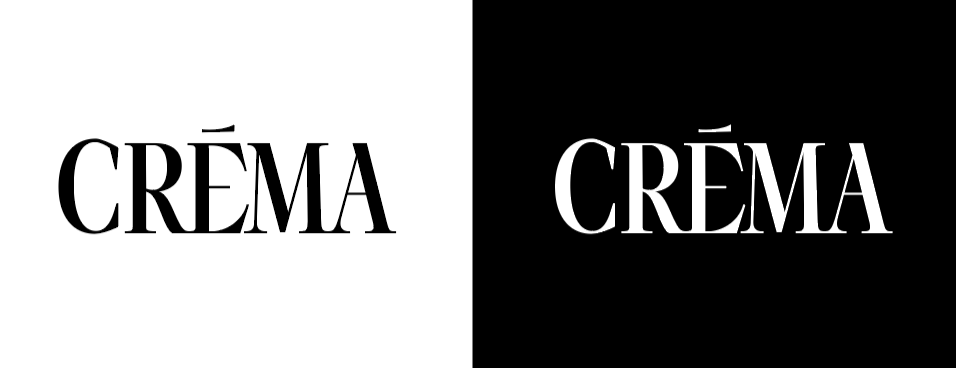
As the brand has been building a significant reputation with their trusted client they were keen to keep consistency. This meant keeping a type-based logo, but elevating the typography used.
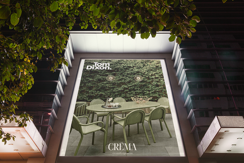
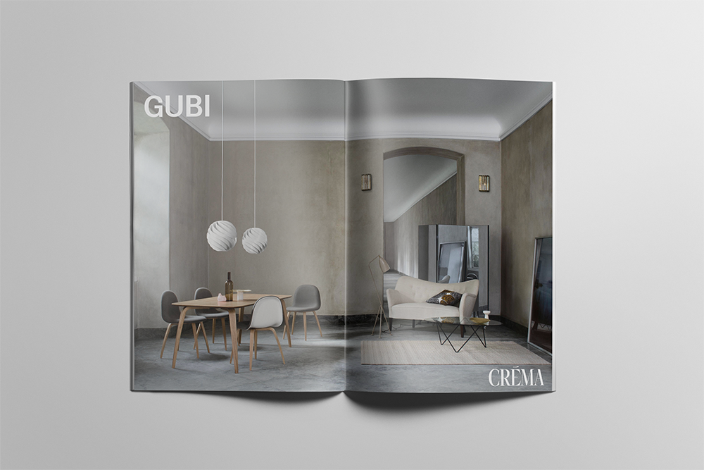
This resulted in an elegant and refined logotype that speaks to the quality and beauty of the items they stock as well as their European origin (as most of the brands they carry come from the UK, Italy and Denmark). It was also imperative that the logo would be able to hold it’s own when featured next to these brands in their marketing communications.